hello miguel
About
Archive
Photos
Replies
Jan 26, 2025
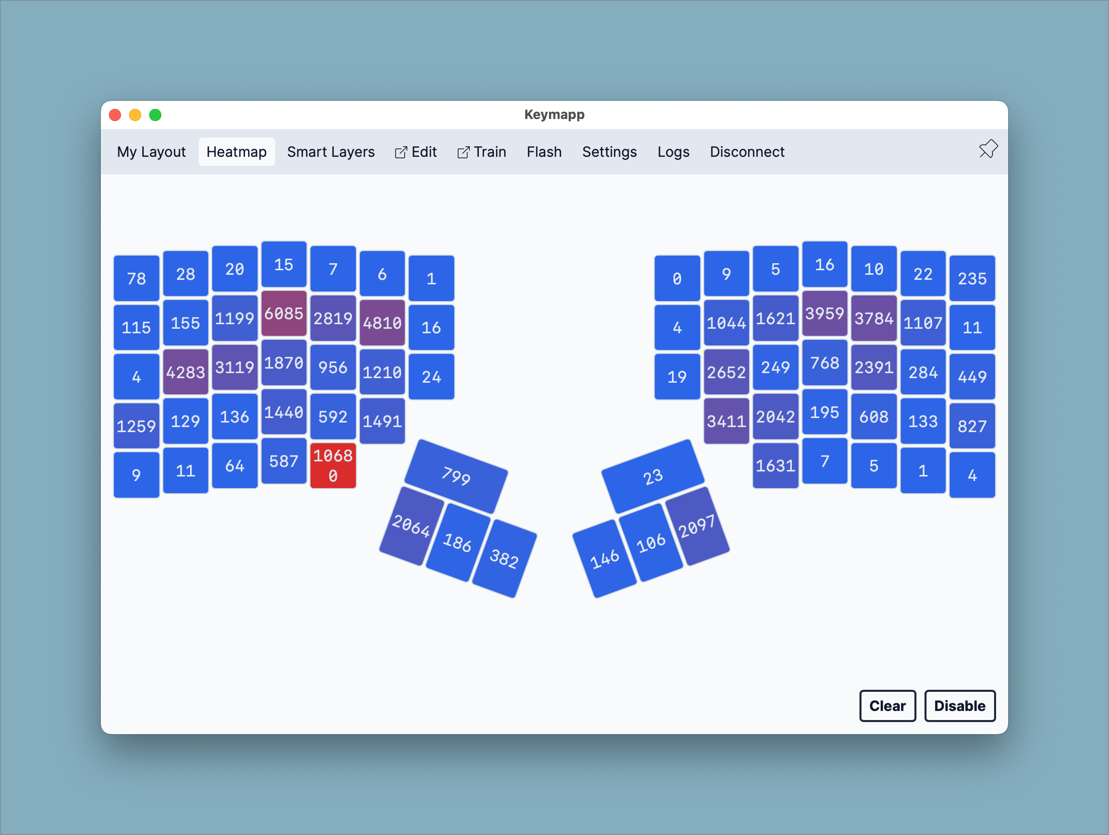
My keeb heatmap